
Many are the techniques you can implement to elevate your landscape photography game. Adjustments that will leave you walking away with consistently better results. Keeping your horizon straight, availing yourself of a tripod, setting a shutter timer or using a remote, locking your mirror—if shooting with a DSLR, manually dialing in hyperfocal distance, and remaining mindful of the rule of thirds are just a handful of techniques that if nothing else will bring sharpness and order to your landscape photograph compositions. Two things here: 1) this is not meant to over simplify the discipline, and 2) all rules are made to be broken—all of them. Think of said “rules” more as guidelines; sound fundamentals that will seldom leave you astray. Of course if you feel the urge to break rank as a means of purposeful expression, by all means do so.
What Is Foreground And Why It Matters To You
Beyond the technical aspects of the aforementioned a primary component of your composition worth your attention is foreground—the subject that occupies the closest space to the observer (your viewers!) of your photograph. Here’s your chance to pull your viewer into the imagery. Think of movies, videos, or articles you read on the Internet: I’d hazard the majority of us are making a decision within the first 10-20 seconds of whether this content is worth our time. Hooks are important, think of them as the first impressions that they are, and think of foreground as the hook into your landscape. It’s literally setting the scene.
Much of what I’ll share will be most helpful to photographers working at wide angles. Let’s say from 35mm down to 14mm. Though the principles are still applicable at other focal lengths. The bulk of my landscape work happens at 14mm. Nice and wide. When shooting wide angle the concept of perspective and a vanishing point becomes readily apparent. The wider your lens, the more amplified the effect on perspective and the deeper your vanishing point becomes—noticeably pushing objects at the center of your frame back toward the horizon. The wider your focal length the more the foreground object takes prominence in your composition. Take one look down a viewfinder sporting a wide angle lens and you’ll notice the optical distortion that exaggerates the size and angles of whatever object you’ve chosen to place in your foreground. This distortion effect is what affords a stimulating foreground—an important component to compel your viewers to care about your landscape. Apply this concept with the rule of thirds, where you place photo subjects in the corner thirds of your composed frame. Imagine a tic-tac-toe board superimposed on your viewfinder. (In fact, many cameras will do this for you!) It’s solid practice to place key subjects at any of the four intersections of the tic-tac-toe grid. In many cases (not all) it’s good practice to place your landscape foregrounds in the crosshairs of the bottom-left or bottom right-intersections.
Let’s See Foreground In Practice
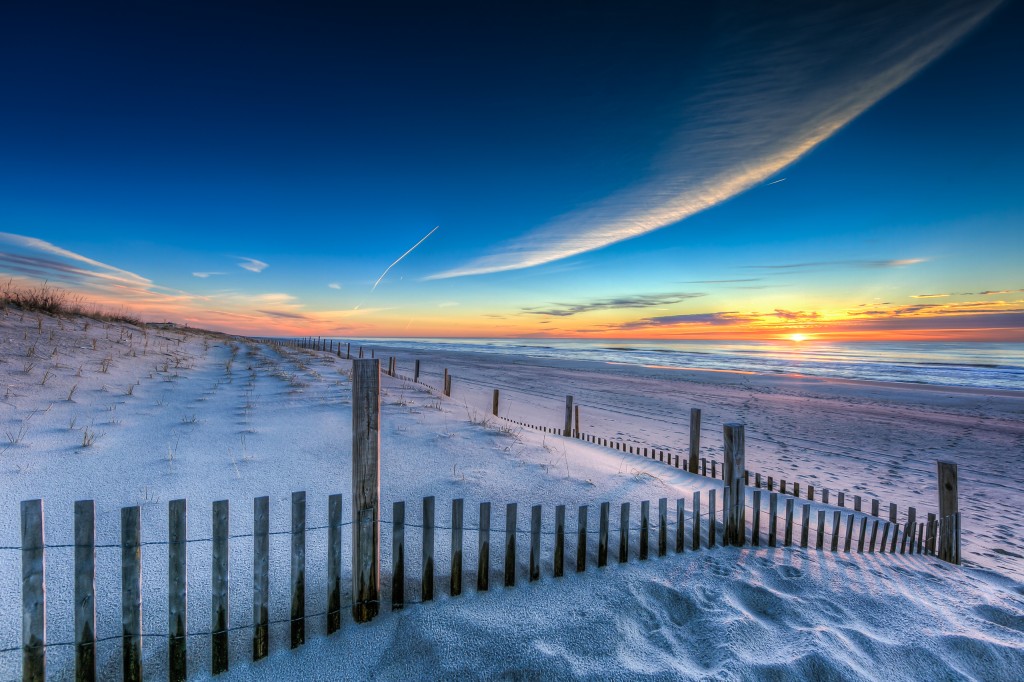
Starting out with a winter sunrise on the beaches of Ship Bottom, NJ, this example features a prominent piece of foreground. Much of the lower third of the image is occupied by an arcing section of dune fence. This coupled with the rolling berm pulls the viewer right into the scene. Its purpose is immediately apparent, invoking imagery of kicking off your sandals, walking up a sand path and out onto the beach, stopping at the apex to scan the horizon. The foreground here has an added bonus in that its arc balances out the swooping cloud feature moving from the center of the photo off to the top right. Now try if you might to imagine this photo without the dune fence foreground. Sure, it would still be serviceable—good color, nice sky, a cool cloud feature—but it wouldn’t hold nearly the same visual balance and weight. It would render a world I’d be far less interested to step inside. I’d feel plopped randomly into a sea of sand instead of what is so very obviously a beach walkway for coming and going.
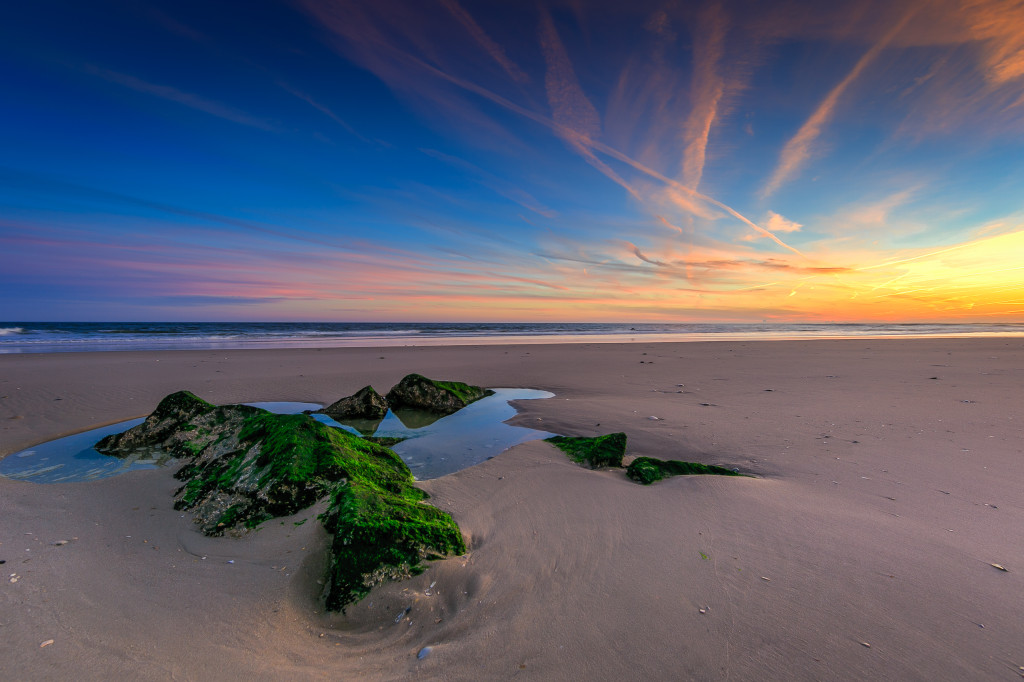
This photograph offers a more obvious example of just how boring a landscape shot can be in the absence of attention commanding foreground elements. Strip away the jetty rock and tide pool combination and we’re left with nothing more than a monotone expanse of sand occupying what would otherwise be half the photograph. Instead I made this shot by getting up close and personal to the mossy jetty rock with my camera and tripod; my rig was about 15 inches from the rock nearest the viewer, while sitting atop the tripod approximately 16 inches off the ground. Getting low and getting close is essential to creating a dramatic foreground representation—this is particularly true as your focal lengths get wider. The intimate camera placement accentuates the distortion effect I mentioned earlier; because I’m so close the jetty rock appears much larger to the viewer than it is in real life. With the foreground well established, large and in charge in the lower left third of the photograph, I am able to play off the great sunset clouds and color in the opposite upper third of the composition. Again we see how the rule of thirds helps us achieve balance in our visual weight.
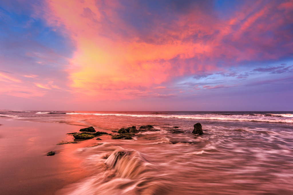
I’ve been eager to share this example in the context of foreground exploration as there were many moving parts in this scene and little time to work. The sunset conditions here were spectacular—one of the best skies I’ve seen—but when you’ve got an eastward facing sunset sky every second counts and you have little time to burn. Under the auspices of A+ lighting it would be easy to let finding a visually pleasing foreground subject slip down your list of priorities, and rightfully so. This time I got lucky. A serendipitous section of jetty rock was exposed a few hundred yards to my north. I was able to scurry over in time, aggravate my hamstring, sink my tripod into the wash, and make out with one very fortuitous exposure.
Here we have a few elements working in the foreground composition. First we have jetty rock, much of which is covered by the rushing waters swelling in with the tide—leaving the more exposed sections of jetty rock as we transition further back into the middle ground section of the frame. Visually the water brings both movement and presence to the entire lower third foreground. Notice how it is particularly exaggerated toward the center at the very bottom edge? This leaves a little waterfall over the very top of the front rock covered by all that rushing water. Sometimes it’s better to be lucky than good, and here the timing completely worked out.
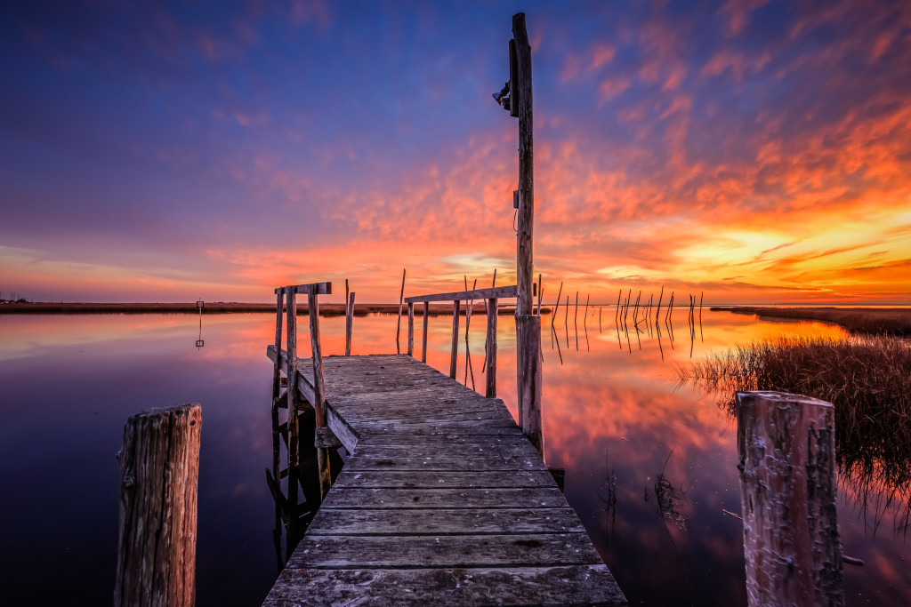
In this instance the composition is all about viewer participation. A digital welcome mat. It doesn’t take much to breakdown what the foreground is doing here, and more importantly, how it is informing the viewer. It’s a clear invitation to step forward and into this striking sunset marsh scene. Two bits of bulkhead and a section of dock with a dogleg left calling out to us as an old mahogany wardrobe would a child.
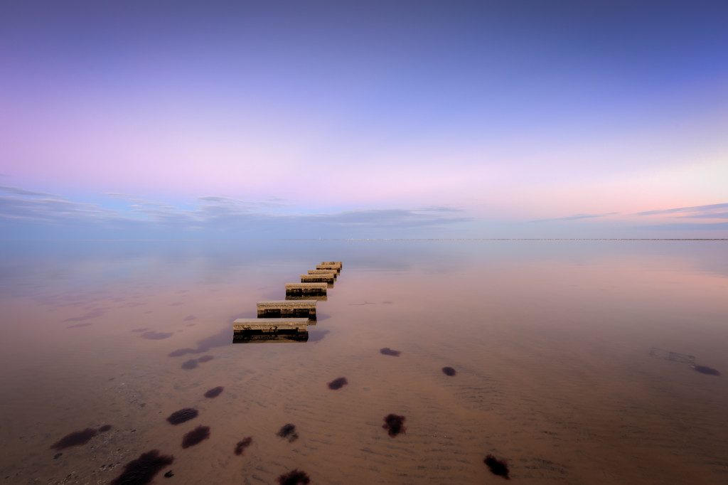
Let’s hear it for minimalism. Not much is happening in this photograph, and that’s precisely what I find its biggest strength. Aside from a beige to pastel palette and calm shallow water, the anchor of this frame is the step-like object that I believe are docking stations to tie up jet skis. Don’t quote me on that. However, we can have a philosophical discussion on whether said docks occupy the middle ground vs. the foreground in this composition. I’m happy to hedge and pronounce it as both. More so this speaks to “rules” I mentioned at the outset—fundamental guidelines are great, and it’s hard to argue against pedantic adherence to the rules, so long as we embrace our own exceptions and interpretation. We are here to flex our creative muscles, after all.
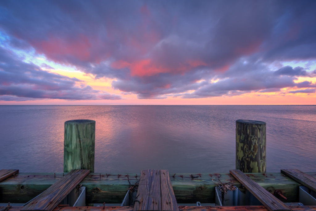
We’re replaying many of the themes covered by We Face the Path of Time. Bulkheads, docks, and a pleasant landscape. Here the foreground brings us back into the realm of visual storytelling. It’s hard to miss the dilapidated state of this section of seawall. Rusted out nails, boards reclaimed by the sea, and remnant sedge grasses wedged in all kinds of nooks and crannies letting you know this wall can hardly hold back the bay when push comes to shove. It’s easy for the observer to spend time working through the comings and goings of the foreground. When did this storm hit? How long has this been in disrepair? It doesn’t look that old, but what is it that really happened here? We’re setting the hook. Whetting the palette before the viewer’s eyes move on out over Barnegat Bay and onto the sunset.
Make Foreground Work For You
Follow these steps to begin composing better landscape photographs today
- Scout your location: Do you have a favorite, go-to landscape location you like to shoot? Even if you do it’s always a great practice to give yourself time to explore new spots when you’re not under a time crunch to produce a photograph under what could be fleeting lighting conditions. Be prepared. Work out your compositions beforehand, keeping foreground elements top of mind.
- Revisit: Remember the spots and shots you like best. Return to these locations. Reuse that foreground. A boon to landscape photographers is that the sky is never the same. Light and clouds are an ever changing system, and even from the same spot no two shots will ever be the same.
- Be mindful: When you’re on location don’t settle for the first shot you see. One thing I like to do is set my tripod down at the spot I think I want to shoot, and then I’ll further explore the area with my camera handheld bouncing from spot to spot, checking the viewfinder to see if I can find something better. If not you can always saunter back to your tripod that’s sitting there waiting, holding your default spot.
- Get close: The wider you’re shooting, the more you should adhere to this principle. Find a cool piece of foreground and give way to personal space. Get in there. Get close. Get to know it. This will translate directly to your viewers.
- Get low: Don’t just get close. Get down and get dirty. Lower that tripod and crouch down toward the ground. More often than not I am shooting my landscapes less than two feet off the ground.
- Stop down: My standard operating procedure is to stop down three full stops from wide open. On my 14mm this takes me from f/2.8 to f/8. When going for tack sharp results the benefits are twofold: 1) it increases sharpness, and 2) it widens the depth of field of your hyperfocal range. This allows you to get as close as your lens will allow you to keep your foreground in focus will still maintaining acceptable sharpness all the way out to infinity—the horizon.
- Be there: No technique will help you more than being out there in nature with a camera. Cellphone, mirrorless, DSLR, it doesn’t matter. If you’re not making the time to get out there prepared to shoot, all the skills in the world will never make a shot happen. The most important thing you can do it get out there and keep shooting.
Leave a Reply